Saturday, March 29, 2014

The Joys of Archer


One of the joys/evils of Netflix is "binge watching". For the past week I've been doing exactly that... enjoying the hilarious Archer. 

I really enjoyed creator Adam Reed's "Frisky Dingo" that was on Adult Swim several years back, so I thought I'd enjoy it... I actually enjoy it better.

It's like Mad Men meets James Bond meets (one some people say, since I haven't watched it) Arrested Development (where several of the voice actors acted on).

It's filled with foul mouthed, totally un-pc jokes (nothing is sacred..race, gender, class, homosexuality) and one liners that are literally and or figuratively (one of the shows many runnings gags) that will make you laugh out loud.

Sterling Archer (who definitely has a Don Draper vibe to him) is a hugely handsome, suave, self centered, alcoholic, man-whore with Oedipus complex issues who just happens to be one of the best secret agents in the world.
He's simultaneously dim-witted while knowing tons of obscure facts about film, tv, literature and history.

The cast is rounded out by the sexy (at least bi-racial) Lana who seems to be the only one with any sense in the spy agency (though she has some sex issues), and extremely large hands.

Pam..gossip monster, bear claw loving HR manager who is, herself, a foul mouthed, sex-crazed, HR nightmare waiting to happen herself. 

Cheryl- the totally airhead, LSD, choke sex loving wealthy heiress who is a useless secretary

Cyril- the stuffy/uptight comptroller/accountant who never gets to save the day.

Ray- The  VERY openly gay, West Virginian field agent

Dr. Krieger- who may not even be a doctor who spends most of his time experimenting on mechanical and organic monstrosities, and who is in love---with an Anime hologram.

And last but not least, Malory Archer, former Cold War spy and head of ISIS, who herself, a lot like Archer is an alcoholic self centered woman, (and mostly absentee mother) who keeps on chasing after money, and the older men who have them. As much as she hates her son, he always ends up getting him out of trouble.

The animation style has a highly stylized 60s comic book feel to it. 

You also have no idea what year it takes place in. The KGB and Soviet Union still exists, Lana and Archer drive late 60s/early 70s muscle cars. The office computers appear to be Apple Lisa's, while the mainframe computer are huge tape drives , but everyone has cell phones, GPS, Sat Phones and text messaging.

It takes A LOT to make me laugh, so Archer is definitely a keeper in my book. Makes me want to check out Arrested Development and SeaLab 2021 now...

Sunday, March 9, 2014

Everything Is Awesome!! In the Lego Movie


Legos were one of my favorite childhood toys. I didn't really put them away till I got to high school (embarrassing to admit, yes, I know!)

Back in the 80s there was only "City", "Space" and "Castle" Lego. But I enjoyed them all, especially Space and City. My mom tried to get me into "Technics" perhaps thinking I was getting too old for Legos, but I resisted!

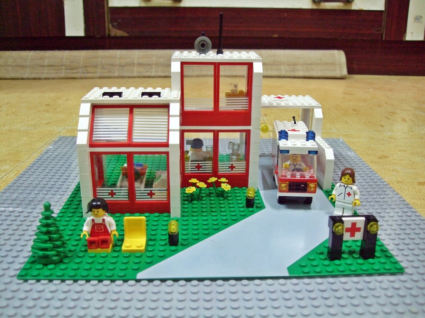
One of my favorite sets, the Emergency Medical Center


Even though today Lego has branched out into licensing deals with films, tv and comic books (From Star Wars to DC Comics to the Simpsons), it's still essentially the same build-a-world "interlocking brick system"

So the kid at heart in me was excited and very curious when I heard they were making a LEGO Movie.  I finally saw it today and I was not disappointed.  Just like Legos themselves, it was a wildly inventive adventure, filled with jokes for both adults and kids.

Of course being a kids movie, there has to be a message..but it doesn't beat you over the head nor is it too syrupy.

Focusing on themes like believing in oneself, individuality, creativity,the balance between when its good to be a free thinker, and when its good to be a part of team.

"Big Business" is certainly a target of the film, which is ironic since both Lego and Warner Brothers are huge businesses themselves.

What makes the Lego Movie a lot of fun is the mashup of the Lego "multiverses". City, Space, Castle, Pirates, DC Comics, Lord of The Rings, Harry Potter, Star Wars, Teenage Mutant Ninja Turtles, The Simpsons all share the screen at the same time and interact with each other. I had no idea Lego Batman had such a big part in the film, which made it interesting also. However being a Warner Brothers movie (who owns DC) the Marvel Superheroes are all absent.


The Lego Movie doesn't take itself too seriously, and pokes fun at Lego toys themselves(Barry, the outdated 80s Space Lego who cant let go of the past) , along with all its characters.
Batman is obsessed with being dark and brooding, even writing a song about it, and swimming in dude/bro culture.
Geen Lantern being the obnoxious overbearing friend that Superman can't stand
Vitruvius gets Gandalf and Dumbledore confused
Wonder Woman's invisible jet being blown up, but all you see is the fireball since its invisible.
Lando Calrissian is the overly slick ladies man trying to pick up women with bad one-liners.

There also clever little homages to movies like 2001, The Terminator, Lord of The Rings, and The Matrix.

The movie also shares some elements of Pleasantville and Back To The Future in how "perfect worlds" start to crumble when people start thinking for themselves.

It's nice when there is animated film that both kids, adults, and kids at heart can all enjoy on different levels.

EVERYTHING IS AWESOME!!


Saturday, March 8, 2014

time.com Redesign and The Case of The Missing Global Navigation

Jakob Nielsen and his Nielsen Norman Group seems to has a love/hate relationship with the web design community. While his usability work is definitely pioneering, he seems to be an old curmudgeon that ignores how graphic/web design is an important part of User Experience. For him its definitely function over form. 

One recent article put out by the Nielsen Norman Group by by Jennifer Cardello and Kathryn Whitenon  “Killing Off The Global Navigation: One Trend To Avoid” I found myself agreeing with quite a bit. Their summary states

Summary: For desktop sites, demoting your main content categories into a drop-down menu makes it harder for users to discover your offerings.”

If you are hiding your main menu, how can people quickly jump from section to section of your website? 
Traditionally, global navigation appears on every page of a website, and serves 2 functions:
  1. Allows users to switch between top-level categories easily, no matter their current location
  2. Ensures that even users who don't enter through the homepage can quickly get a sense of what is available on the website”
This brings us to the new redesign of Time Magazine's Website,  who along with Slate, NPR, NBCNews, have chosen to ditch the traditional omni-present ttop global navigation, for a drop down menu using the "horizontal bar icon" that mobile sites have used to hide their navigations.
--

News websites traditionally have had a top navigation that links you to news separated into categories…international, local, sports, economy, technology, etc.


But as news organizations have started to embrace responsive web design, some are getting rid of their top navigations in favor of hiding the menu in a drop down, using the same horizontal icon that mobile websites use to hide their main menus. 


Bloomberg News is a strange hybrid of both, offering the menu icon AND a top nav, with repetitive links, and when it opens it obscures the website's logo. Odd.


To hide a menu on a mobile device makes sense, since there is a lack of room/real estate to display a full menu. But at desktop or even tablet size it makes little sense, since there is room enough to show the main menu. Why make it harder for users to get to the section of news they are interested in?

For older and non smartphone users, do they know that the horizontal bar icon = menu? It’s relatively new convention. It’s probably why both Time and NBC had to put the word MENU under the icon, since some people may not know what it means.


However when you do get to an interior section on both Time and NBCNews, they do offer a more traditional top navigation of subtopics within that section.


But to be fair and balanced, the new time.com has a good balance of text, image, and whitespace. Headlines are easily scannable. Their is no indulging in trendy huge photos or horsey type.  It’s the anti-NBC.

Getting around in the site is a bit difficult. When you click on "Latest" or "Popular" does suffer from the trendy and sometimes annoying infinite scroll. How do i get out of the long list of articles? How can I switch to the Sports or Technology section. I feel a bit lost in the site.


All in all, its becoming very interesting to see how websites, especially news and e-commerce sites in how they embrace Responsive Web Design. It’s almost like 1995 all over again. 

Monday, March 3, 2014

The Awful nbcnews.com Redesign

nbcnews.com has a new look! It debuted about a month ago, right in time for the Winter Olympics coverage in Sochi. (oddly enough the NBC Sports site did not get a makevoer)


You can use it on your smartphone and tablet!

It has huge pictures and huge headlines!

And its a big old mess if you’re on a desktop or laptop.

Some say its a dumbing down/adolescent view of the news for a short attention spanned culture with big pictures and images instead of headlines. I wouldn't go that far, but I can see their point.


Seems like I’m not alone in my dissatisfaction of the website as you read on the comment sections on reddit,  huffington post and newscast studio

So what's wrong with the website?

The Tiled/Modular Layout

Looks like the top brass at NBC and the agency who designed it (who also allegedly designed slate.com also) took the “mobile first” philosophy a bit too seriously.

Some have complained “since NBC broke up with Microsoft, why would they go to ‘Windows 8’ design”. In NBC’s defense, the only similarity is the tiled design, other than that, it shares little with Windows 8 “metro” design eschewing its bright color and thin sans serif type.

A very overly simplified explanation of Mobile First is to design for the mobile experience FIRST, then move to the desktop. 

It makes a lot of sense, since so many people access the web via smartphones and tablets now. Mobile sites used to be an afterthought. But it seems the designers at nbcnews.com committed the opposite sin..the desktop version is afterthought this time.

nbcnews has gone to the tiled/modular approach for the desktop version of its site. While this approach works well on more image/art dominated websites like flickr or pinterest, on a news site it makes little sense. There is no visual or information hierarchy to how the news is presented. There's also mysterious white space where it looks like a tile is missing

Whats the most important news stories on nbcnews.com? Hell if i know! Everything is given the same weight and mass. Each story is pretty much given the same importance, from a story about “Animators Closer to Capturing Physics of Curly Hair” to “Why Does Putin Stir up So Much Trouble for America”


If you’re quickly scanning for headlines on nbcnews.com, good luck…you really can’t.


The Navigation

Both Slate and NBC News have decided to ditch the traditional vertical side or top horizontal nav bars in favor of the relatively new mobile convention/affordance of clicking on three stacked vertical bars to reveal a mega menu. There's even the word MENU under the the vertical bars just in case you don't know what that means!

Since real estate is precious on mobile device, this makes sense that you have to hide some menu information. But on the desktop, not so much. The type size also just seems too big which leads us into…


Horsey Type and Images

Big headlines and big images are all the rage in the new “flat design era” (Is this Web 3.0 now? I don’t think it is, but it would be a good name for it). I actually like 1em=16px for reading text on the web. Its a bit bigger than the norm, but its more legible, especially for those with vision problems.

But the huge sans serif font headline images just look TOO big on the desktop version of NBC News. There’s also a curious use of white space… there seems to be an imaginary right column that has nothing in it. Shrink your browser size, and it goes away, but once way it looks awkward. View it here.


Nice Looking News Sites are Possible!

To give NBC some credit, at least they are trying. Most news site are a mess. Huffington Post looks unprofessional. CNN Looks crowded, but at least its organized (similar to the BBC) But both the BBC and CNN offer separate mobile site experiences and are not responsive.

Al Jazeera America actually has a great well designed layout for their desktop version, and its responsive.  My only gripe is the tiny typography for their top horizontal navigation.

France 24 also has an excellent website layout, but its more adaptive for tablets, and offer a separate mobile site.

Russia Today’s website is somewhere in the middle. It won’t win any beauty awards, but it’s responsive, and there is some information hierarchy going on.

Did NBC News Get Anything Right?

Well, the site is VERY social media/sharable friendly with each story having a sticky social media nav bar, which is a nice feature.
The website does use a lot of modern website trends as I've stated, but they all seem to be used badly.

Do you like the new nbcnews.com redesign? What's your favorite news site?