Wednesday, May 22, 2013

The Work of Peter Saville


I was in a friend's basement when I was 16 years old, and he put this CD on. It was New Order's Substance, and the song was Subculture. I was totally entranced. It was electronic, but it was rock. It had dry british "white" male vocals with soulful "black" female backup singers. It was tension and contrast, beats and rhythm. I had to learn everything I could.


So I went on a mission. To devour everything and all things New Order. But along with New Order, came the work of seminal designer Peter Saville. Primarily it was the art work for New Order's final album of the 90s, Republic, that set me on my way to becoming a graphic designer. I was unaware, he was using a relatively new graphics program called Photoshop to create stunning, layered, Photomontages


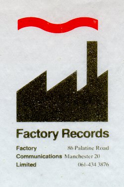
Just like Mark Farrow, Peter Saville is a graphic/music design "rock star". He was the primary designer for Factory Records,  the legendary punk/new wave record label from Manchester England. Factory Records was home  A Certain Ratio, The Durutti Column, Happy Mondays, Joy Division (which later became New Order)


Fact Magazine Eloquently Stated "Saville’s designs did far more than illustrate the records on which they appeared. The implicit message of his work was that music is always more than just music, and his high-concept, modernist-influenced sleeves invited record buyers to see connections between pop and avant garde art." -1 Jan, 2009

Peter Saville could be seen as the ultimate post-modernist. He was not afraid to take classical, renaissance, or modernist pieces of art and paintings, and dropping them into a totally new context, very much like his sleeves for Joy Division's closer or New Order's Power Corruption and Lies. He mixed minimalism, appropriation, and humanist serif fonts for a stark effect.


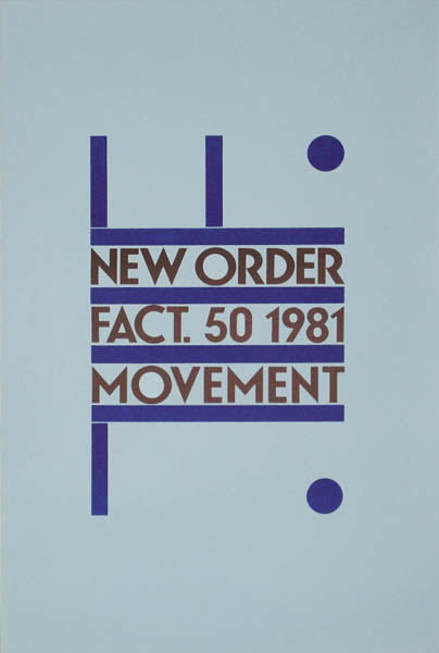
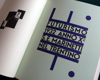
Saville was no one trick pony, however evolving his style over time. He also was influenced by 20th century typographic/layout pioneers like Jan Tschchold and Futurist Fortunado Dutero


Bauhaus and Constructivist influences can be seen in his work for Orchestral Maneuvers In The Dark's Architecture and Reality Sleeves.


While there is much talk (and controversy) of Saville's appropriation of design history's past, there is also Saville's fascination with technology and the future. This can be seen as early as his classic cover for Joy Division's Unknown Pleasures LP


The visual interpretation of a frequency from a pulsar star that Joy Division  picked out themselves that they found in an encyclopedia, Saville took the idea and ran with it.

New Order's sleeve for Blue Monday, another legend that goes down in graphic/music/package design history. Influenced by the programming of early sequencers, and samplers, and the highly electronic feel of New Order's foray into full on dance music, its a massive 12" floppy disc


"The single's original sleeve, created by Factory designer Peter Saville and Brett Wickens, was die-cut with a silver inner sleeve.[18] It cost so much to produce that Factory Records actually lost money on each copy sold. Matthew Robertson'sFactory Records: The Complete Graphic Album[19] notes that "[d]ue to the use of die-cutting and specified colours, the production cost of this sleeve was so high that the single sold at a loss."

Saville later got into photographic experiments with fellow designer Trevor Key using the dichromat format, used primarily on the Brotherhood and Technique albums for New Order, photographic flowers, metals, and old paintings, turning them into stunning, almost unreal objects.


Saville's Artwork on New Order Republic focused on the banality of stock photography, then warping them (sometimes literally) in Photoshop to create new compositions, and juxtapositions, using layering, filters, and transparency.


Perhaps like a hip hop producer or artist, you may disagree with Saville's "sampling" of other artists, or you can see the brilliance in his way to take something old, changing its context, and making something entirely fascinating, much like Marcel Duchamp and other Dada and Surrealists before him.

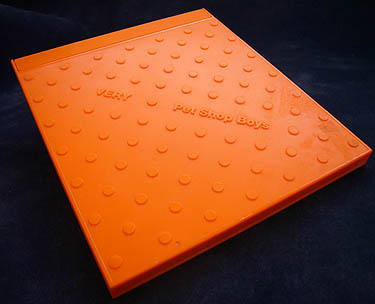
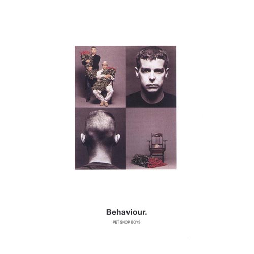
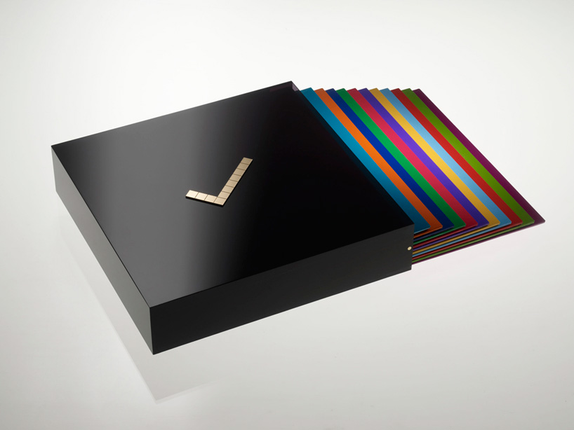
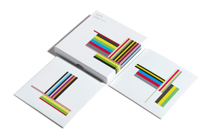
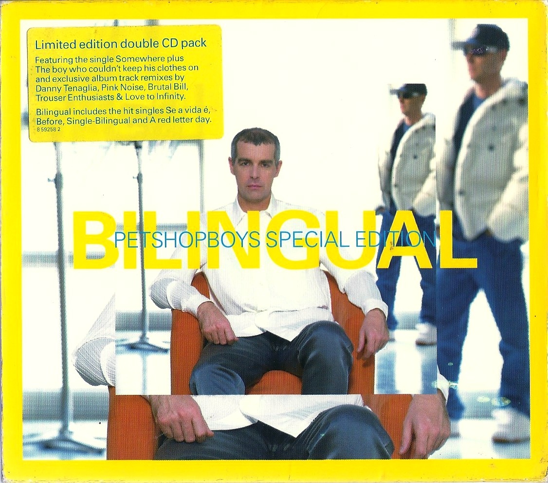
Other Peter Saville Works (along with Trevor Key and Howard Wakefield)


Friday, May 17, 2013

Mark Farrow


On one of those various memes and internet questioners that are on the internet, I remember one of them asked "have you ever bought an album just because the album art was cool"

Honestly, no, but if it was designed by Mark Farrow, I probably would. Most people don't know graphic designers by name. It almost has a communist/socialist feel to it.. art for the people by the people. Who ever designed the Chex Mix you just ate this morning didn't sign their name to the box.(for good reason). Mark Farrow isn't one of those designers.

My love of music and design are married. Since it is called the music business, of course there is marketing involved. Which means cover art and packaging design. Some artists like New Order and the Pet Shop Boys clearly "get it", some who you think would be more design savvy like Madonna hasn't really produced any stunning album art or packaging.  And well Britney Spears...


The 25+ year collaboration of designer Mark Farrow and The Pet Shop Boys has been a beautiful one. Who can forget the wildly inventive "Lego/Manhole cover" design for PSB's Vary? The beauty marriage of simple type and simple image on Please and Behaviour. Or committing music marketing blasphemy with leaving the bands photo off the cover with an amazing typographic treatment in vibrant yellow. Clearly someone squawked, because later expanded editions did have the Boys on there.


Farrow worked for more than just PSB, but also worked with Kylie Minogue, Spiritualized, Manic Street Preachers, and Orbital.


Minimalism,sophisticated typography, stark color on white fields, and innovative untraditional innovative packaging are all hallmarks of Mark Farrow and his Design company over the past 30 years.

Not only have they worked in the arena of album art, but have done environmental design, logo design, and even the graphics on a sail boat for the Volvo Ocean Race.


Once a freelance designer for the seminal Factory Records/Hacienda that Peter Saville (who will be featured in a later article), Farrow broke out on his own.

And he's a huge fan of Gill Sans.. a man after my own heart.


Wednesday, May 15, 2013

Logo: Split Pride Parade, Croatia


Professor Tom Kovacs and Hungarian Movie Poster Design


I would not be a Graphic Designer if it was not for Professor Tomas Kovacs. No, literally, I would not be.

The school of Graphic Design at the University of Illinois is highly competitive. Maybe 100-200 applicants apply. And at that time they only accepted around 30 to the program.

I did not get in the first year I applied. I actually didn't get in the second year I applied. But there is an appeals process, and I resubmitted my work to Professor Kovacs. 

He must have saw something in me that the review board didn't see the first time, because he admitted me to the program

Born in Budapest Hungary, he is a Professor Emeritus in Graphic Design at UIUC. A highly skilled and talented graphic designer, but he excelled in poster design.


Deeply inspired from the rich graphic and poster design traditions from his native Hungary, he taught us the power of combining type and image for evocative visual communication. Many of our assignments centered around poster design. We watched Fritz Lang's Metropolis and Akira Kurosawa's Dreams, then had to reinterpret them in our own visual style.

In film's golden era, Hungarian artists had to do the same thing for books, movies, and plays from the States since they would not get the original press materials. This often led to hand painted and drawn posters that eclipsed the original US source material.

The Rainmaker
Compare the typical melodramatic original poster to the Burt Lancaster/Katherine Hepburn classic The Rainmaker, to the beautiful Hungarian woodcut interpretation


The US version goes for hollywood schmaltz and plays up the passionate love story, while the Hungarian version tells more of the story of the con man who comes to town promising he knows how to make it rain.

Star Wars
While the US poster for the original Star Wars movie is quite famous and iconic in its own right, The Hungarian version, with its hand drawn and painted approach focuses much more on the sinister and evil elements of the Empire in episodes IV-VI,  especially Darth Vader


2001 A Space Odyssey original poster is also iconic in its original form, but it focuses more on the fascination of future space technology, using realistic illustration.


The Hungarian Interpretation, uses blue duotone stills from the movie, with intense contrast of red and yellow accents, focusing much more on the humanity and the experience of Dr. David Bowman. It's stark and emotional, rather than the more flat and technical aspects of its US counterpart.


Cleopatra
Liz Taylor's big budget, critical failure Cleopatra couldn't be saved by a Movie poster. This time we have the reverse, while the US Movie poster utilizes a painted scene from the movie, using a faux cuneiform  style typeface


The two Hungarian version of the movie uses duotones and black and white stills, photo montage and Swiss/International style typography and layout for a much more compelling, modern approach. It doesn't focus on the melodramatic love story once again, or u, but focuses on the power of Cleopatra as a woman and leader.


I encourage you to google more of your favorite movies, and see the inventive solutions Hungarian poster artists came up with to their US equivalents. 


Saturday, May 11, 2013

The Work Of David Carson


The perfect counterpoint to Josef Muller-Brockmans hyper rigidity and strict type and layout philosophy of the Swiss Style, is renegade graphic designer David Carson.

To many he is the father of "grunge" and distressed type and images, that seem to echo the music of both Seattle, and the burgeoning Industrial Music scene led by Nine Inch Nails. (Where are Gravity Kills and Filter right now?) But his work is far more important and substantial than that

An important (some might say the most important) graphic designer of the 1990s, he through out the International Style's playbook, and brought to us type as texture, image, and decoration. As art director of surf culture magazine Ray Gun He mixed type faces, sizes, weights, in almost a ransom note style fashion. He created typographic blasphemy by stretching and distorting typefaces. Type sat at uncomfortable angles, running into other text on the page.


He wasn't afraid to to break out of, abuse, or just completely jettison Muller-Brockman's grid in favor of intriguing, emotional, though often illegible layouts at Ray Gun magazine. No one could ever accuse Carson's work of being cold or sterile.


Carson's work was perhaps activist against graphic design itself, but certainly not in the political sense. He followed that grungey distorted type gravy train all the way to NBC, CNN, Coca Cola, Sony, Nike, and Microsoft.


One of his more famed collaborations was with Trent Reznor, when he did the art work for "The Fragile"


Unfortunately, Carson's style became so mimicked and copied, it turned into cliché. Just watch the opening credits of David Fincher's Se7en done by famed opening credits/title house Imaginary Forces.


Carson was especially influential to me, and my study of Concrete Poetry in the late 90s, which I received a summer research grant for. I admired his use of type as image, texture and grit, and tried to incorporate it into my own work.

"Concrete poetry or shape poetry is poetry in which the typographical arrangement of words is as important in conveying the intended effect as the conventional elements of the poem, such as meaning of words, rhythm, rhyme and so on.
It is sometimes referred to as visual poetry, a term that has evolved to have distinct meaning of its own, but which shares the distinction of being poetry in which the visual elements are as important as the text."