Big difference in the way it looks and feels (us nerd folk call it GUI, or graphic user interface), right?
Everything has come very basic, clean, simplified, an pictogram like. I'm expecting a sign to point us to the women's and men's bathrooms on the Windows Start Screen.


Gone are the faux leather, brushed aluminum surfaces, and glossy glass embossed buttons and heavy drop shadows. The design historian in me automatically thinks of the signage for the 1972 Munich Olympics, right down to the bright primary colors (that some critics are calling Fisher Price/Playskool-esque). Then, elegant san-serif type is used.

This is what people are calling "Flat Design" a newish trend (or philosophy depending on who you talk to). It's also been called "honest design"
"Instead, flat advocates (flatvocates?) argue that GUIs—graphical user interfaces—should eschew style for functionality. That means getting rid of beveled edges, gradients, shadows, and reflections, as well as creating a user experience that plays to the strengths of digital interfaces, rather than limiting the user to the confines of the familiar analog world. In web design as well, "flat" pages rarely introduce dimensionality, shadows, or textures into the equation, relying instead on parallax scrolling and visual clarity to communicate."
http://gizmodo.com/what-is-flat-design-508963228

People work well with metaphors and what's familiar to them. Electronics/music players are metal like iTunes interface. Our address books of the past were leather bound, so why not make it look like a leather bound book. Even the file folders on our computer often look like the manila paper file folders we use in the office. The recycle bin/trash looks like an actual trash can.
Us fancy pants people call this skeumorphism.. computer/digital interfaces looking like real life objects and surfaces. According to Wikipedia " "a physical ornament or design on an object made to resemble another material or technique"
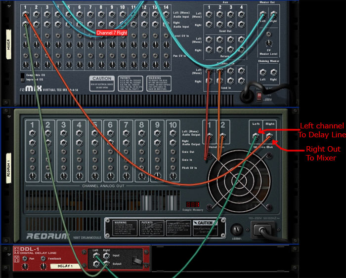
Probably the most "skeumorphic" program I can think of is the music making software program Reason, by Propellerheads. It's purposely made to look like an actual rack of music gear. So much to the fact that you can flip the rack around and using virtual patch chords and rewire the virtual gear.

Some compare Flat Design to the Bauhaus and Swiss International Style reaction to the overly ornamental and decorative styles of the Victorian era.
And since my own design education we had the Swiss style beat into us, I like Flat Design quite a bit.


But its obviously not so simple. As a musician who does use Propellerhead's Reason, I love the fact that it looks like virtual gear. I also like the virtual cabling in the back. I think if I actually could afford some real music gear I would understand now how to hook up audio gear like reverbs and compressors together.
So like most things, it's a bit of a compromise. I think use Flat Design where it makes sense. The virtual dissection of a "flat frog" for a science class seems pretty silly, but on interfaces like Windows8 (which functional/features problems to me are for more troubling than how it looks) and iOS7. it will be interesting to see.
But if EVERYTHING goes flat in two or three years the web is going to look very boring.