
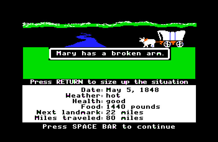
Confession: I am an Apple Fan Boy. I have an iPod, iPhone, iMac and MacBook. I've used Apples most of my life, even way back to the 80s and playing Oregon Trail in grade school (i usually died of Typhoid or my meat spoiling)
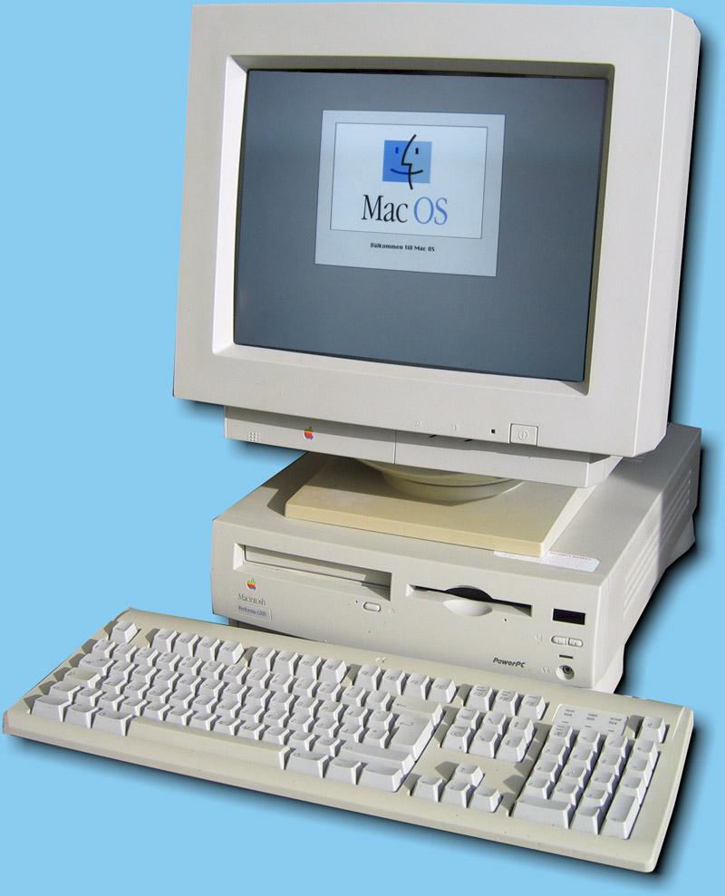
My first Apple Computer was a Macintosh Performa in 1996..nearly 20 years ago.
As a Graphic Designer and an Electronic Musician, they have been invaluable tools for me. I keep my average computer around 5 years. I work them till they die. I get every penny out of them.
Confession 2: I like the Flat Design phase..when done well.

http://www.psd2html.com/

http://www.swackett.com/s2/
Even Google has embraced it. I especially like the Google Now "card flip" thing

So when I got home last night and downloaded iOS7 to my iPhone 4s, the aspiring UI/UX designer in me was a bit underwhelmed by the look and feel.
The new features and functionality are quite good for somethings. Like the new photo gallery, like the new rapid burst for the Camera. Like the new swipe up and go directly to your settings (Airplane Mode, WiFi, Flashlight, ITunes song currently playing)
The Google Earth like Zoom In/Zoom out Animations are ok. Its like heated leather seats in your car..do you need them, no, but its nice.
I also like how you can double tap on the home button and get the new mutltitasking programs, flick them up, and close them.
So some nice functionality.
And pun is fully intended, there's just something very flat to the whole thing. It's like Apple made an overcorrection from the faux leather bound address book and the brushed metal of iTunes, to something thats without any dimension.
Like I said I like Flat Design, but there's something very unfinished and unrefined about these icons.
I think the Flat UI kit from Designmodo strikes a nice balance with just a hint of drop shadow and gradient without going glossy button crazy

Some of the Icons I just dont plain understand.
Without the text underneath, what is this?

Either its the logo for a gay youth center, or its supposed to teach youngsters about ROY G BIV, but what it doesnt say to me is PHOTOS.
I am not that old, but the typography on the camera is just too tiny, and in all caps. poor readability. I guess you do have the option of cranking up the text size but i hear it looks rather ugly

And what is with the game icon? Either I'm at a beach party, or I'm blowing up balloons for my nieces 4 year old birthday party.
Apple's own home page is in a state of schizophrenia at the moment with the menu bar still in gradient, shiny beveled button world, why the content is all flat-ted out

The biggest thing is..well iOS7 is pretty much like getting your car detailed and repainted...looks nice and new, but its the same car underneath. Behind all the animations and such, its still pretty much the usual iOS
So Flat design critics, I'm starting to catch on what your saying how flat design can look Juvenile....to me iOS7 does look very Mattel/Play-Skool. Great for the 3-10 yo demographic, but not so much for adults. (but of course you've probably handed your iPhone or iPad over to your kid as an electronic babysitter, so maybe Apple is on to something)
Also Flat Design critics, I can agree with you on fear of a "flat internet" because that will look VERY boring in about a year or two.
No comments:
Post a Comment