Saturday, December 7, 2013
Radiant Orchid- Pantone's Color of the Year 2014
http://pantone.com/pages/index.aspx?pg=21131
Hmm, now its just trying to get a client to go along with it!
Thursday, December 5, 2013
The New 2015 Ford Mustang
the New Ford Mustang, what do you think all? Keeps classic Stang design cues while pushing forward and looking pretty sexy.
More at Autoblog
http://www.autoblog.com/2013/12/05/2015-ford-mustang-official-photos-reveal-info/
Disconnect for Creativity
http://www.fastcompany.com/3022448/how-to-be-a-success-at-everything/how-creativity-works-and-how-to-harness-its-power
I enjoyed reading this Fast Company article about creativity. Especially the part about tuning out and dropping out.
"1. Create time for solitude.
In interviewing others, I found that solitude is the No. 1 creative habit of highly creative people. If you’re immersed in online distractions and other busy-ness, you’ll never have the space to consider the ideas you’ve gleaned from elsewhere, or think about how to remix them. So while connection is important (see other steps below), time for solitude is just as critical and often forgotten."
As an electronic musician, I always found melodies and song ideas come to me doing mundane things..walking the dog, taking a shower, washing the dishes.
Since I am redoing my online portfolio, can this work for me visually/graphic design wise also?
Unless I'm doing some intensive reading, I almost have music on ALL THE TIME. So the silence is a bit jarring. I even fall asleep to a light "relaxation" playlist of mostly soundtrack, ambient and classical music.
--
I took up long distance running in the Spring of 2013, so after reading the Fast Company article, I decided to do something i NEVER do. I ran without music. I was mostly playing with music ideas in my head though! Can I get visual thoughts too?
I'll try it again this morning!
Tuesday, December 3, 2013
I Really Need To Learn jQuery
I have to stop procrastinating and fighting the forces of life. Every employer out there is looking for it. I guess I'm afraid of it. But not knowing it is killing my career chances.
But can I call myself a "front end developer" without knowing it. Just knowing HTML and CSS isn't enough.
I think it boils down to fear. I'm very right brained and visual. I've always coded because I HAD to, not because I wanted to.
My brief experiences with PHP and JavaScript just left me scratching my head. But I guess it's time to go down to the public library today and face my fears head on.
I do have a book on it, but I'm thinking of starting with code academy to soft launch me into it.
What are other people's experiences with jQuery
Monday, December 2, 2013
Things to stay away from with my portfolio redesign
1. Parallax/One page Design
Yeah its cool, but I find it overwhelming sometimes. I like controlled dosages of information2. Flat Design
Ok I'm not total anti flat design, quite a bit of I enjoy and since my Adobe Illustrator skills are not stellar thats all I can make, but I want it my new portfolio to have some personality.
3. The huge ass "HELLO MY NAME IS XXXX AND IM A WEB DESIGNER" at the top of the page. Seems like everyone is doing it.
4. "Creative" navigation.. yes it shows off your design and coding chops, but I don't want people needing instructions on how to navigate my website.
5. Picture of myself. I still have bauhaus/international style manifestos in my head of Graphic Design as "anonymous" art for the people by the people. You don't sign your work (unless you're a poster maker)
And to be honest, don't want people getting hung up on my race and physical features when my real focus should be my work, not what I look like.
6. Listing all the big brands you've worked for-- well as an agency or freelancer this is important, but for me, not so much. And its all presented in the same way on most websites

A Design Unicorn Job Ad
Last month I wrote about the "design unicorn" debate that is going on in web design/development circles. Well here's an ad I just got from a recruiter. How many candidates do they think they can find having an ad like this:
Title: Web Designer
Location: River woods, IL
Duration: 6+ Months
Location: River woods, IL
Duration: 6+ Months
Web Designer/Developer
We are looking for a digital designer/web developer with excellent design sensibilities, great portfolio of interactive campaigns and a thorough understanding HTML5/CSS3/Responsive design.
The candidate must be a fast learner with intellectual creativity, who can thrive in a high energy, fast-paced environment. The candidate will have the opportunity to have an immediate impact and use their energetic, easy-going personality to work within a team environment. This role will require and utilize knowledge over a broad skill set to meet and exceed the daily challenges.
The ideal candidate will have at 1-2 years of experience in HTML5/CSS3 Design, a proven, thorough understanding and track record of producing responsive websites, emails, and other web-related content. Must be able to program websites using html5, CSS3, JavaScript/JQuery. Must have additional programming knowledge and understanding of PHP and .Net (yes both). Will be responsible for designing and developing moderately complex multimedia communications such as websites/microsites, banner ads, e-newsletters, email templates, etc.
Required Design/Programming Skills:
• Exceptional Eye for Great Interactive Design
• HTML/HTML5
• CSS/CSS3
• JavaScript/JQuery
• .Net
• Adobe CS5+
• Responsive Design
• Wordpress
Other required skills:
• Self-directed and capable of working in a fast-paced team environment
• Very strong writing, grammar and verbal communication skills
• Ability to develop new and update existing code
• Strong understanding of web standards and usability
The following skills are considered a PLUS:
• PHP
• MySQL
• Self-directed and capable of working in a fast-paced team environment
• Very strong writing, grammar and verbal communication skills
• Ability to develop new and update existing code
• Strong understanding of web standards and usability
The following skills are considered a PLUS:
• PHP
• MySQL
Wednesday, October 30, 2013
The Swiss Army Knife/Design Unicorn
A few months ago when I was unemployed and searching for a job, I wanted to write a post which I had titled “The Swiss Army Knife Designer” Though I was afraid potential employers would see it and I would get black listed.
I was seeing ridiculous job postings wanting you to know a laundry list of requirements that seemed almost impossible, wanting you to know everything from The Adobe Creative Suite, to html and css, to php, jsp, ruby on rails, and you must also bake cakes and walk the company dog.
Some of the companies I wanted to apply for but just didn’t because the list of skills seemed too intimidating.
Some people say, they just shove all that stuff into a job description, and they really don’t expect you to know ALL of it.
Little did I know that there was a term and some sort of debate going on in the web design/development land going on about what I was thinking about the “Swiss Army Knife” designer, with a much funnier and catchy name…”The Design Unicorn”!
From Usability Counts and Author Patrick Neeman
“We need a unicorn.”
“What’s that?”
“You know, someone who can code, design graphics, design user experience, write copy, and do all the HTML and CSS for us. They’re cheap and easy to find. They should be able to take out the trash. Oh, and wash our cars wearing a bikini.”
And unicorns can fly.
The unicorn designer is the most in demand and rarest of product team members — someone with excellent interaction design skills, visual design skills, and coding ability. Unobtanium.”
—
I agree that there are design unicorns out there.. Luke Wroblewski (who I actually had 3D design class with at the University of Illinois, and he was even good at that!) , my friend Mark Raguž at Nivas in
Croatia http://nivas.hr/en/about-us
But to be fair and balanced there is also the counter argument that we do need design generalists
http://www.forbes.com/fdc/welcome_mjx.shtml where David Cole says “You don’t have to be good at everything to do great work” And that design within itself has multiple tasks..which he’s right..image making, composing, typography, information hierarchy, gestalt, balance, color theory, so I can see what he’s saying.
My education in Graphic Design at University of Illinois Urbana/Champaign in the mid to late 90s was heavily print focused, leaning towards the Bauhaus/Swiss-International style of design. Two web classes were offered at the time, and I did take both.
But I have often worked in the world where I would design a web interface, do the basic HTML for it, then hand it off to a backend designer to do the heavy lifting/programming/database work. So even since the start of my career I have been more of a design specialist.
Also being right brained and just having overall math deficiency syndrome, coding doesn’t appeal to me at all. I do HTML and CSS because I have to, its part of the job description, not because I want to.
But now it may be an “adapt or die” situation where UI/UX is becoming the dominant trend in web design/development.
Where do you weigh in on the design specialist/design generalist debate?
Tuesday, October 8, 2013
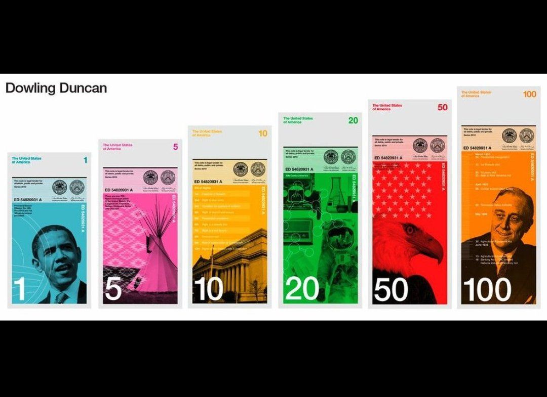
New 100 Dollar Bill Design
It's all about the Benjamin's baby. The 100 dollar bill get's a redesign
The good--finally some color on US money. Large type "100" on the back can help people with vision problems.
The bad- US Currency needs a redesign in general and needs to follow the rest of the world's by creating different bills in different sizes and colors. Why? It helps those with vision problems (or even those who don't) know by touch what bill they are using/paying with.
Different colored bills can help you quickly what bill you are using. Think of all the experiences you've had at a store "I gave you a 20..." but the cashier claims you didn't (especially in lower lighting settings like restaurants and bars) Bills in other colors could help alleviate this problem.
But don't hold your breath, people dislike change, and I can just see some politicians flipping out on saying how we are wrecking the US and its traditions by changing the design of our money
Thursday, September 19, 2013
New Google Logo
iOS7.. When Flat Design Goes Wrong
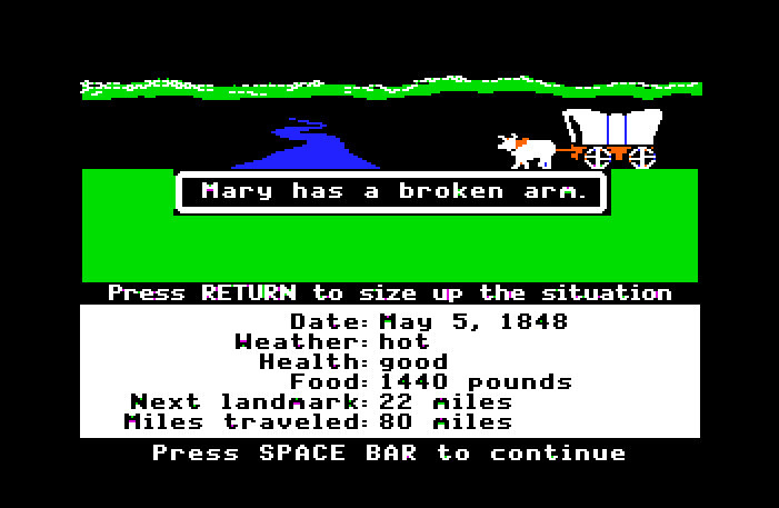
Confession: I am an Apple Fan Boy. I have an iPod, iPhone, iMac and MacBook. I've used Apples most of my life, even way back to the 80s and playing Oregon Trail in grade school (i usually died of Typhoid or my meat spoiling)
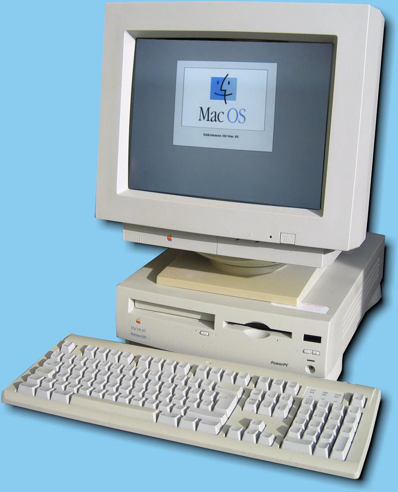
My first Apple Computer was a Macintosh Performa in 1996..nearly 20 years ago.
As a Graphic Designer and an Electronic Musician, they have been invaluable tools for me. I keep my average computer around 5 years. I work them till they die. I get every penny out of them.
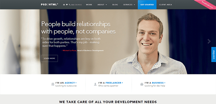
Confession 2: I like the Flat Design phase..when done well.
http://www.psd2html.com/

http://www.swackett.com/s2/
Even Google has embraced it. I especially like the Google Now "card flip" thing
So when I got home last night and downloaded iOS7 to my iPhone 4s, the aspiring UI/UX designer in me was a bit underwhelmed by the look and feel.
The new features and functionality are quite good for somethings. Like the new photo gallery, like the new rapid burst for the Camera. Like the new swipe up and go directly to your settings (Airplane Mode, WiFi, Flashlight, ITunes song currently playing)
The Google Earth like Zoom In/Zoom out Animations are ok. Its like heated leather seats in your car..do you need them, no, but its nice.
I also like how you can double tap on the home button and get the new mutltitasking programs, flick them up, and close them.
So some nice functionality.
And pun is fully intended, there's just something very flat to the whole thing. It's like Apple made an overcorrection from the faux leather bound address book and the brushed metal of iTunes, to something thats without any dimension.
Like I said I like Flat Design, but there's something very unfinished and unrefined about these icons.
I think the Flat UI kit from Designmodo strikes a nice balance with just a hint of drop shadow and gradient without going glossy button crazy
Some of the Icons I just dont plain understand.
Without the text underneath, what is this?
Either its the logo for a gay youth center, or its supposed to teach youngsters about ROY G BIV, but what it doesnt say to me is PHOTOS.
I am not that old, but the typography on the camera is just too tiny, and in all caps. poor readability. I guess you do have the option of cranking up the text size but i hear it looks rather ugly
And what is with the game icon? Either I'm at a beach party, or I'm blowing up balloons for my nieces 4 year old birthday party.
Apple's own home page is in a state of schizophrenia at the moment with the menu bar still in gradient, shiny beveled button world, why the content is all flat-ted out
The biggest thing is..well iOS7 is pretty much like getting your car detailed and repainted...looks nice and new, but its the same car underneath. Behind all the animations and such, its still pretty much the usual iOS
So Flat design critics, I'm starting to catch on what your saying how flat design can look Juvenile....to me iOS7 does look very Mattel/Play-Skool. Great for the 3-10 yo demographic, but not so much for adults. (but of course you've probably handed your iPhone or iPad over to your kid as an electronic babysitter, so maybe Apple is on to something)
Also Flat Design critics, I can agree with you on fear of a "flat internet" because that will look VERY boring in about a year or two.
Thursday, September 5, 2013
The New Yahoo Logo is...
is gross
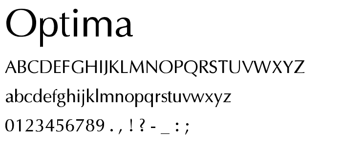
That's just Optima with some beveling on it.
Flat Design may be a fad, but at least the thin typography is elegant. You teased us for a month for this?
That's just Optima with some beveling on it.
Flat Design may be a fad, but at least the thin typography is elegant. You teased us for a month for this?
Saturday, August 24, 2013
Flat Design..Design Fad or the next step in UI/UX?
Unless you don't own a computer, I am more than sure you have seen or are using Microsofts Windows8 or have seen the sneak previews of iOS7, the next operating system for Apple's iPhone and iPad.
Big difference in the way it looks and feels (us nerd folk call it GUI, or graphic user interface), right?
Everything has come very basic, clean, simplified, an pictogram like. I'm expecting a sign to point us to the women's and men's bathrooms on the Windows Start Screen.
Gone are the faux leather, brushed aluminum surfaces, and glossy glass embossed buttons and heavy drop shadows. The design historian in me automatically thinks of the signage for the 1972 Munich Olympics, right down to the bright primary colors (that some critics are calling Fisher Price/Playskool-esque). Then, elegant san-serif type is used.
This is what people are calling "Flat Design" a newish trend (or philosophy depending on who you talk to). It's also been called "honest design"
"Instead, flat advocates (flatvocates?) argue that GUIs—graphical user interfaces—should eschew style for functionality. That means getting rid of beveled edges, gradients, shadows, and reflections, as well as creating a user experience that plays to the strengths of digital interfaces, rather than limiting the user to the confines of the familiar analog world. In web design as well, "flat" pages rarely introduce dimensionality, shadows, or textures into the equation, relying instead on parallax scrolling and visual clarity to communicate."
http://gizmodo.com/what-is-flat-design-508963228
People work well with metaphors and what's familiar to them. Electronics/music players are metal like iTunes interface. Our address books of the past were leather bound, so why not make it look like a leather bound book. Even the file folders on our computer often look like the manila paper file folders we use in the office. The recycle bin/trash looks like an actual trash can.
Us fancy pants people call this skeumorphism.. computer/digital interfaces looking like real life objects and surfaces. According to Wikipedia " "a physical ornament or design on an object made to resemble another material or technique"
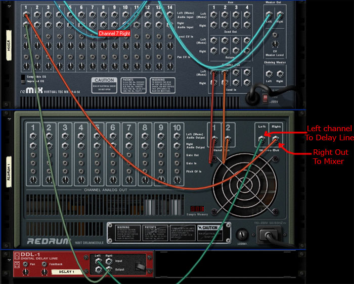
Probably the most "skeumorphic" program I can think of is the music making software program Reason, by Propellerheads. It's purposely made to look like an actual rack of music gear. So much to the fact that you can flip the rack around and using virtual patch chords and rewire the virtual gear.
Some compare Flat Design to the Bauhaus and Swiss International Style reaction to the overly ornamental and decorative styles of the Victorian era.
And since my own design education we had the Swiss style beat into us, I like Flat Design quite a bit.
But its obviously not so simple. As a musician who does use Propellerhead's Reason, I love the fact that it looks like virtual gear. I also like the virtual cabling in the back. I think if I actually could afford some real music gear I would understand now how to hook up audio gear like reverbs and compressors together.
So like most things, it's a bit of a compromise. I think use Flat Design where it makes sense. The virtual dissection of a "flat frog" for a science class seems pretty silly, but on interfaces like Windows8 (which functional/features problems to me are for more troubling than how it looks) and iOS7. it will be interesting to see.
But if EVERYTHING goes flat in two or three years the web is going to look very boring.
Wednesday, June 12, 2013
Is The Adobe Creative Cloud a Scam?
Something about the Adobe Creative Cloud doesn't sit right with me. Adobe joins Norton and other companies with monthly/yearly subscription type services. To keep your software going, you have to keep on paying.
It seems pretty much like cable tv… you pay a monthly fee for some of your favorite programs, but just like cable, you are stuck with a bunch of programs you may never want or use.
You pay 50 dollars a month for a yearly subscription. or 75 dollars a month for a month to month subscription with the availability to shut it off at any time.
Also like cable tv, there are no a la carte options. You're stuck with one tier. So if you're a web designer who knows nothing about video, well too bad. Aren't all these programs eating up valuable hard drive space?
Also we all know how volatile the creative industry is and how closely it's tied to the economy. So when the economy goes bad, who usually gets cut first…the creatives…. I've personally been laid off 4 times in my career. So if i lose the ability to pay for the Adobe Creative Cloud, well there goes my livelihood and ability to freelance
Of course there are some benefits.. constant updates, a lower threshold for people to buy the software. For Adobe, there is constant revenue stream, instead of an influx of money every two years when a new Creative Suite used to come out, its every month.
But as a creative professional, I really don't have much of a choice. Of course I can keep on using CS5 forever. I'll probably keep CS5 on my desktop for emergencies, then, unfortunately, upgrade to the Creative Cloud on my desktop
Saturday, June 1, 2013
Robbie Cooper - Immersion:Porn
NOT SAFE FOR WORK
Artist Robbie Cooper films people talking about their intimate relationship with porn, then films their faces watching it.
Everyone has their clothes on, and you only see the interviewees faces, but its entrancing and erotic.
Wednesday, May 22, 2013
The Work of Peter Saville
I was in a friend's basement when I was 16 years old, and he put this CD on. It was New Order's Substance, and the song was Subculture. I was totally entranced. It was electronic, but it was rock. It had dry british "white" male vocals with soulful "black" female backup singers. It was tension and contrast, beats and rhythm. I had to learn everything I could.
So I went on a mission. To devour everything and all things New Order. But along with New Order, came the work of seminal designer Peter Saville. Primarily it was the art work for New Order's final album of the 90s, Republic, that set me on my way to becoming a graphic designer. I was unaware, he was using a relatively new graphics program called Photoshop to create stunning, layered, Photomontages
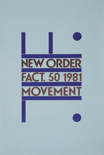
Just like Mark Farrow, Peter Saville is a graphic/music design "rock star". He was the primary designer for Factory Records, the legendary punk/new wave record label from Manchester England. Factory Records was home A Certain Ratio, The Durutti Column, Happy Mondays, Joy Division (which later became New Order)
Fact Magazine Eloquently Stated "Saville’s designs did far more than illustrate the records on which they appeared. The implicit message of his work was that music is always more than just music, and his high-concept, modernist-influenced sleeves invited record buyers to see connections between pop and avant garde art." -1 Jan, 2009
Peter Saville could be seen as the ultimate post-modernist. He was not afraid to take classical, renaissance, or modernist pieces of art and paintings, and dropping them into a totally new context, very much like his sleeves for Joy Division's closer or New Order's Power Corruption and Lies. He mixed minimalism, appropriation, and humanist serif fonts for a stark effect.
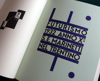
Saville was no one trick pony, however evolving his style over time. He also was influenced by 20th century typographic/layout pioneers like Jan Tschchold and Futurist Fortunado Dutero
Bauhaus and Constructivist influences can be seen in his work for Orchestral Maneuvers In The Dark's Architecture and Reality Sleeves.
While there is much talk (and controversy) of Saville's appropriation of design history's past, there is also Saville's fascination with technology and the future. This can be seen as early as his classic cover for Joy Division's Unknown Pleasures LP
The visual interpretation of a frequency from a pulsar star that Joy Division picked out themselves that they found in an encyclopedia, Saville took the idea and ran with it.
New Order's sleeve for Blue Monday, another legend that goes down in graphic/music/package design history. Influenced by the programming of early sequencers, and samplers, and the highly electronic feel of New Order's foray into full on dance music, its a massive 12" floppy disc
"The single's original sleeve, created by Factory designer Peter Saville and Brett Wickens, was die-cut with a silver inner sleeve.[18] It cost so much to produce that Factory Records actually lost money on each copy sold. Matthew Robertson'sFactory Records: The Complete Graphic Album[19] notes that "[d]ue to the use of die-cutting and specified colours, the production cost of this sleeve was so high that the single sold at a loss."
Saville later got into photographic experiments with fellow designer Trevor Key using the dichromat format, used primarily on the Brotherhood and Technique albums for New Order, photographic flowers, metals, and old paintings, turning them into stunning, almost unreal objects.
Saville's Artwork on New Order Republic focused on the banality of stock photography, then warping them (sometimes literally) in Photoshop to create new compositions, and juxtapositions, using layering, filters, and transparency.
Perhaps like a hip hop producer or artist, you may disagree with Saville's "sampling" of other artists, or you can see the brilliance in his way to take something old, changing its context, and making something entirely fascinating, much like Marcel Duchamp and other Dada and Surrealists before him.
Other Peter Saville Works (along with Trevor Key and Howard Wakefield)
Subscribe to:
Comments (Atom)


